
What is Responsive Web Design
Defining Responsive Web Design
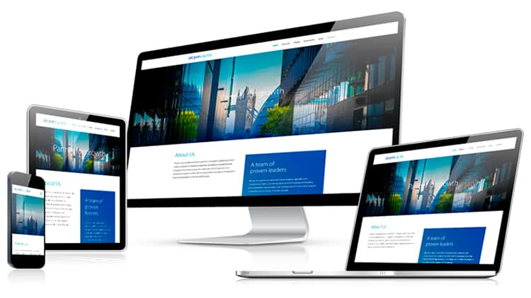
Responsive Web Design is a primary focus for Marketing Agencies regarding a brand’s website. Technology has come a long way over the last few decades, and in the last decade we saw the rise of the responsive website. No more having to scroll left and right and zooming into sections you want to read. No more scrolling along sentences as though you were reading a book with your finger guiding your eyes. Let’s begin by actually defining the word “Responsive.”
Definitions of responsive
• Adjective – reacting to a stimulus
Synonym: Reactive
Example: Responsive to physical stimuli.• Adjective – readily reacting or replying to people, events or stimuli; showing emotion.
Synonyms: Answering, Respondent, Replying
Example: Responsive to physical stimuli.• Adjective – containing or using responses; alternating
So then Responsive Web Design is web design that can react to certain stimuli. Notice we emphasize the word “react” because there is another factor called Adaptive Web Design that we will get into later. However, more on responsive design, your site has to be able to detect the framework of the device it’s being used on, and therefore determine how it needs to lay itself out. It knows to shrink certain images, rearrange element layouts, increase or decrease font sizes and much more. This is because your web developer sets predefined “Break Points” based on width that tell the site when to change its style and layout accordingly. Popular break points are: 1240px, 1024px, 778px, and 480px, though it does not have to be a 4 point set up nor do the values have to be set to these widths but this is a great example of using break points for responsive design.
What is High Performance Web Design
Defining High Performance Web Design
High Performance Web Design is about 2 things, User Experience & Search Engine Optimization. Performance considerations for websites started really becoming a big deal as cell phones began to become more and more popular. This was the real factor involved with the evolution of high performance site design because on mobile the band width, or download speeds are typically much slower than your desktop. Today the average user will see your website on mobile before they see it on desktop. In fact, studies show these days somewhere between 45% to 65% of your site’s users will be on mobile. Studies have also shown that if a website takes more than 2 seconds to load on it will suffer a loss in lead conversions because people lose their patience and bounce back out going to the next brand in the search result instead. It’s best to have a site that loads in less than 1 second on mobile and instantly on desktop.
What is Adaptive Web Design
Defining Adaptive Web Design
We have now learned what responsive web design is, as well as high performance web design; now it’s time to talk about the far less popular topic: Adaptive Web Design. Adaptive design means a site can adapt to its subjective users circumstances. For instance, as an example some designs can detect if the user is on mobile and in this show a different site element than it does on a tablet, laptop, or desktop. Moreover, it can be set to where it’s not just that a person is on mobile, it can be set to measure the bandwidth available and if it detects the speed will be too slow it instead shows a far lighter/less heavy design. This is important because some cell phones will be able to handle more complicated heavy site designs and so it would be a mistake to show a compromised design in such a case. You would want the original to show instead. In conclusion, adaptive usually refers to this example. In short it just means able to detect bandwidth, but there are more factors involved that are too advanced for this articles purpose.